Logoipsum Watch App
A compact, functional Apple Watch interface, enhancing user productivity with simple gestures, quick interactions, and clear, easy-to-read design.

Objective:
Design a compact, efficient Apple Watch interface that enhances productivity with quick, glanceable interactions and simple gestures.
Key Design Features:
Gesture-based navigation (taps, swipes, digital crown)
Optimized readability for small screens
Clear iconography and color usage
Workflow:
Wireframing to simplify user flow.
High-fidelity design focusing on clarity and usability.
Framer prototypes for real-time testing of natural gestures and fluid animations.
The design ensures an intuitive experience that integrates smoothly into the user's daily routine, offering functional yet minimalistic tools for productivity.

Typography

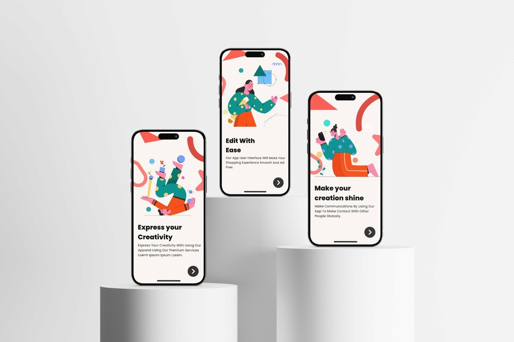
Understanding the User
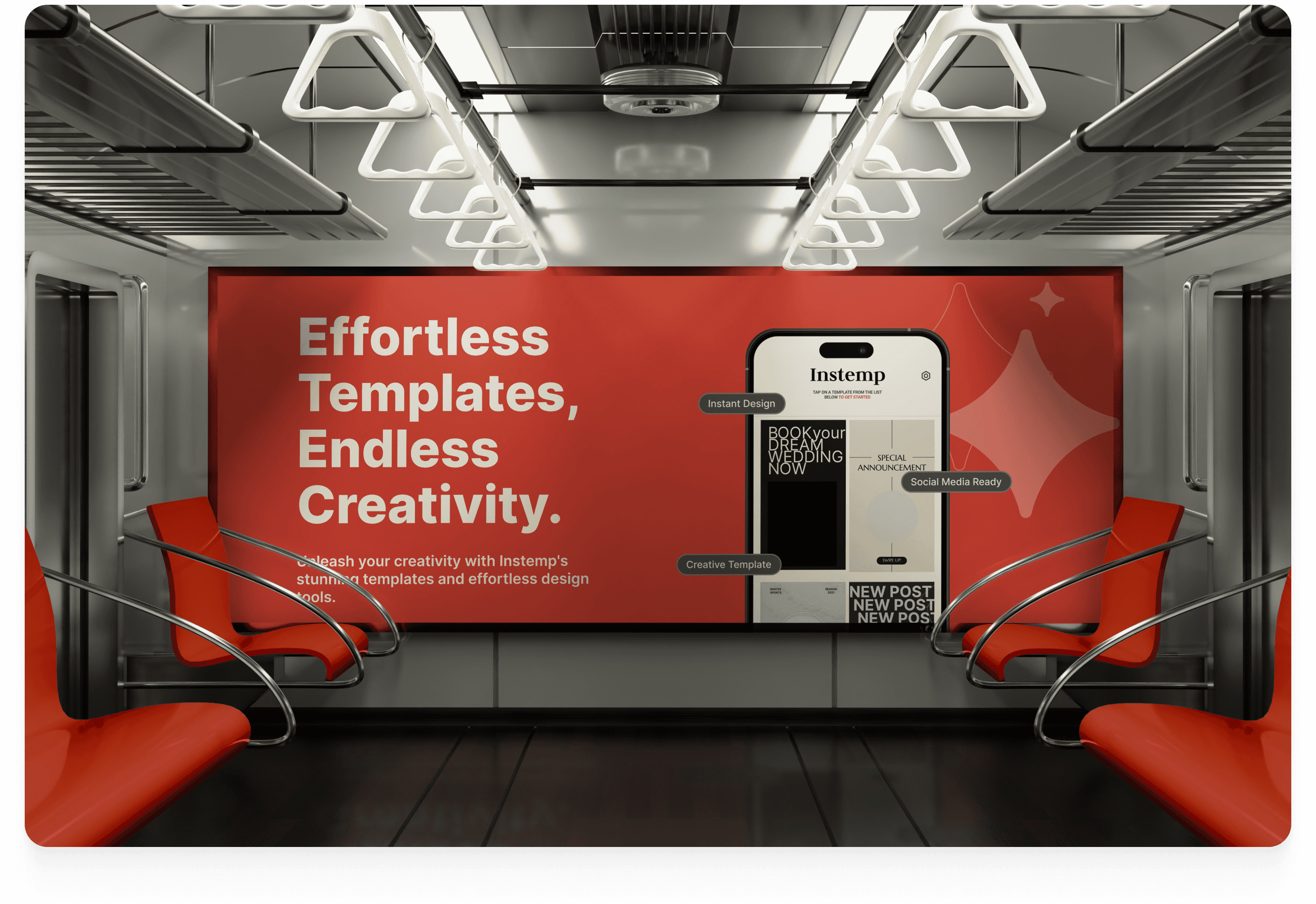
I started my research by analyzing data on Instagram's growth trends and user insights, which revealed common frustrations with template-based design apps. This helped me understand the need for a more seamless and premium experience for users looking to enhance their online presence quickly and easily.
Research Findings
•
Time Efficiency: Users want a quick, hassle-free way to create high-quality Instagram content without extensive editing steps.
•
Streamlined Design: Many existing apps are cluttered and confusing, making it hard for new users to navigate or complete tasks effectively.
•
Unique, Premium Aesthetics: Users are drawn to sleek, intuitive interfaces that feel high-end and encourage creativity without overwhelming them with options.
•
Growing Demand: With Instagram's rapid growth, especially among Gen Z, there’s a rising demand for apps that support content creation tailored to personal branding.
•
Content Diversity: Users seek a diverse range of templates and tools to make their posts stand out, aligning with current digital marketing and influencer trends.


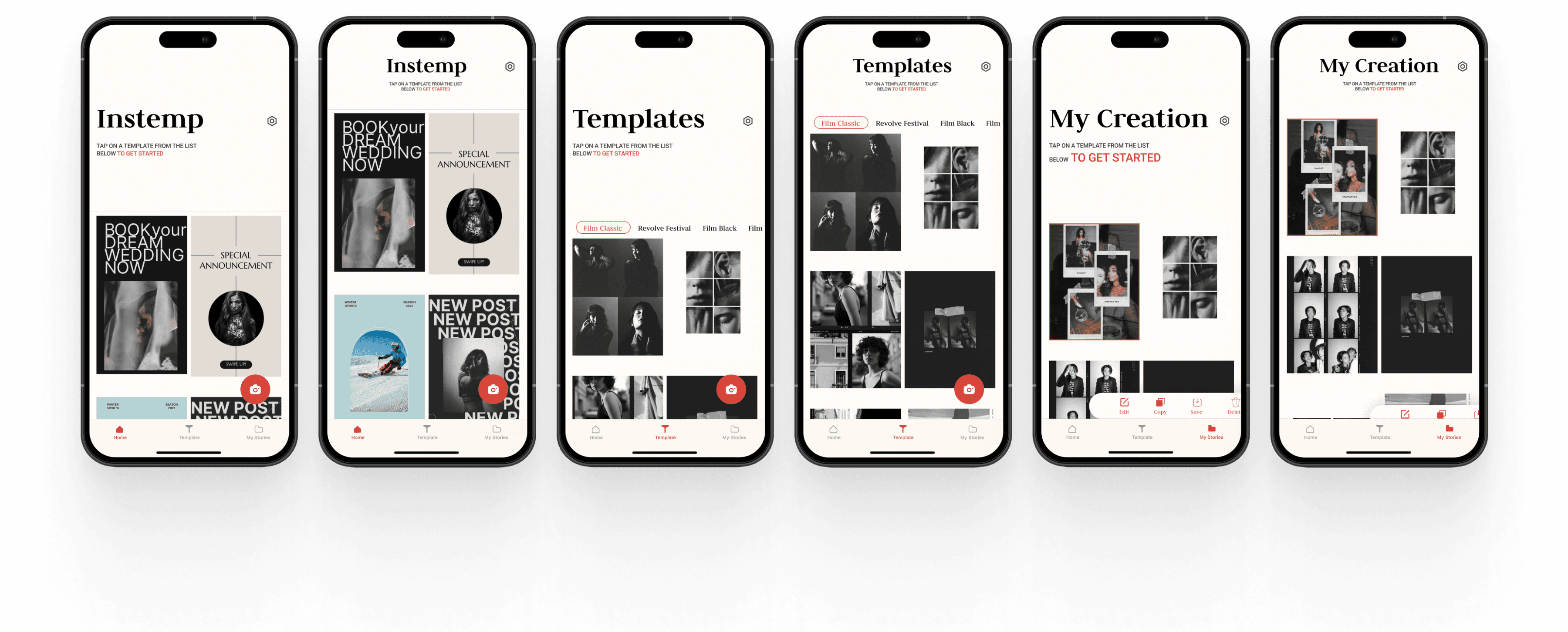
High-Fidelity Wireframes
With the structure in place, I moved on to the final design phase, focusing on each screen's flow and coherence. This step brought all elements together, providing a cohesive visual sense of how users would navigate and interact across the app.

Final Design


Takeaways
•
Streamlining template customization. Instemp allows users to select templates, but I would have liked to enhance customization options, making them even easier and faster for users to personalize their content with minimal effort.
•
Enhancing the “Explore” section. Instemp’s explore feature helps users find trending templates. Adding more dynamic, personalized recommendations based on user behavior would create a more immersive experience.
•
Elevating community engagement. Instemp’s community feature fosters inspiration, but focusing more on user interaction and peer-driven design trends could make it feel even more unique and connected.
Next Steps
•
What would Instemp on other platforms look like? Currently, Instemp is designed for mobile, but adapting it for web or tablet could broaden accessibility.
•
What can be improved in the UI? UX is a continuous process, so additional usability testing and feedback gathering will guide further refinements.