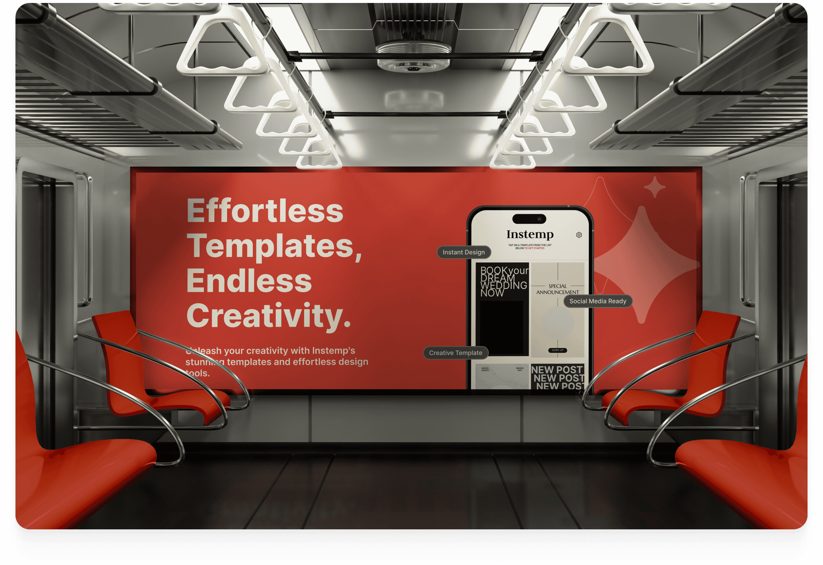
Logo Landing Page
A visually rich website that balances aesthetic design with accessibility, creating an engaging and intuitive user experience across all devices.

Project Objective:
This project delivers a responsive website that blends visual richness with a practical user experience. The goal is to maintain consistency and accessibility across devices, ensuring an engaging experience.
Design Elements:
Clear visual hierarchy
Bold typography and interactive elements
Accessibility-first approach
Consistent browsing experience across desktop, tablet, and mobile
Process Highlights:
Wireframes to define structure.
High-fidelity mockups emphasizing user engagement.
Usability testing to ensure smooth interaction.
By using Framer’s prototyping, stakeholders can experience real-time interactivity, visualizing how the final product will feel for users.

Typography

Understanding the User
I started my research by analyzing data on Instagram's growth trends and user insights, which revealed common frustrations with template-based design apps. This helped me understand the need for a more seamless and premium experience for users looking to enhance their online presence quickly and easily.
Research Findings
•
Time Efficiency: Users want a quick, hassle-free way to create high-quality Instagram content without extensive editing steps.
•
Streamlined Design: Many existing apps are cluttered and confusing, making it hard for new users to navigate or complete tasks effectively.
•
Unique, Premium Aesthetics: Users are drawn to sleek, intuitive interfaces that feel high-end and encourage creativity without overwhelming them with options.
•
Growing Demand: With Instagram's rapid growth, especially among Gen Z, there’s a rising demand for apps that support content creation tailored to personal branding.
•
Content Diversity: Users seek a diverse range of templates and tools to make their posts stand out, aligning with current digital marketing and influencer trends.


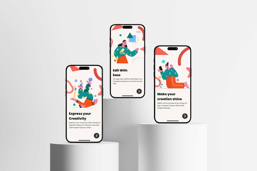
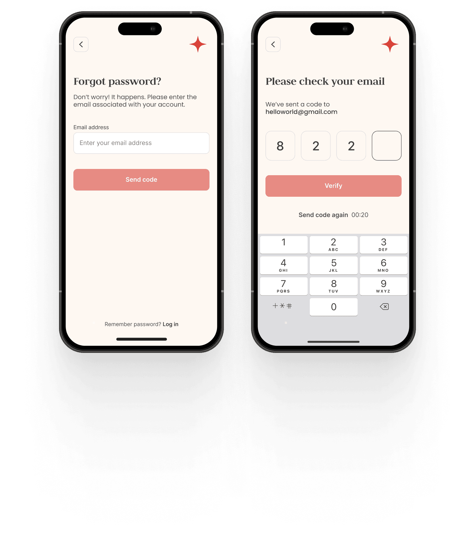
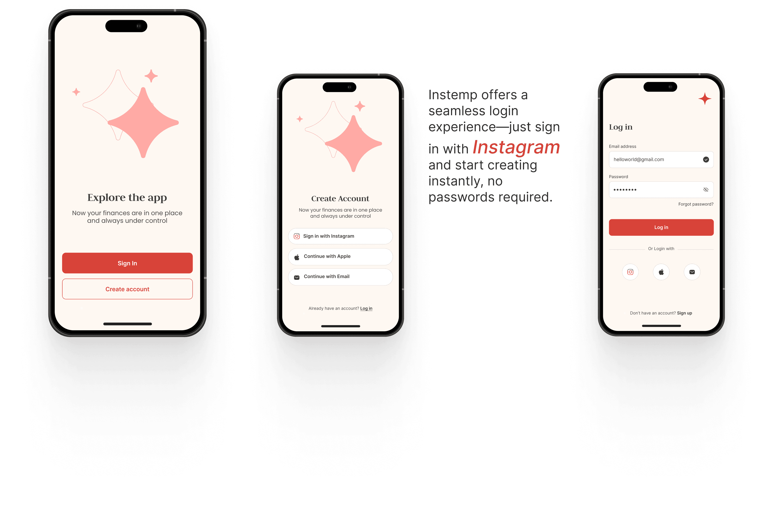
High-Fidelity Wireframes
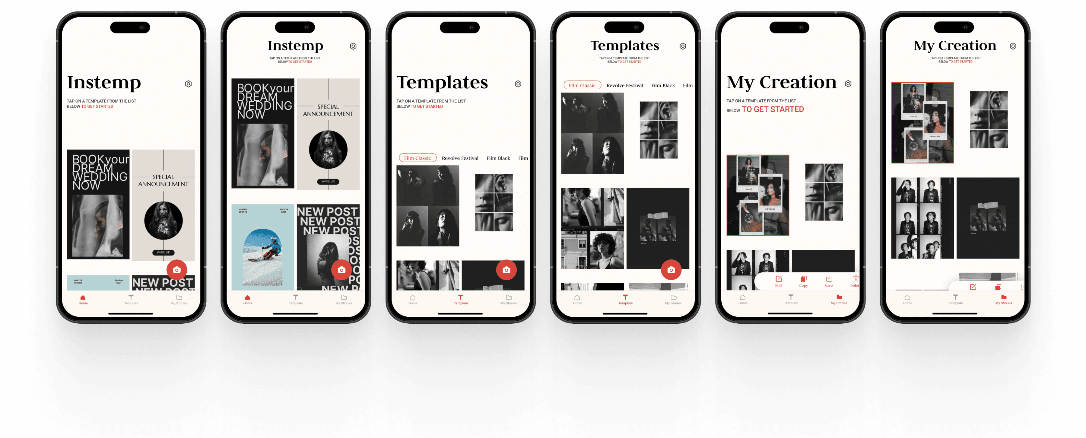
With the structure in place, I moved on to the final design phase, focusing on each screen's flow and coherence. This step brought all elements together, providing a cohesive visual sense of how users would navigate and interact across the app.

Final Design


Takeaways
•
Streamlining template customization. Instemp allows users to select templates, but I would have liked to enhance customization options, making them even easier and faster for users to personalize their content with minimal effort.
•
Enhancing the “Explore” section. Instemp’s explore feature helps users find trending templates. Adding more dynamic, personalized recommendations based on user behavior would create a more immersive experience.
•
Elevating community engagement. Instemp’s community feature fosters inspiration, but focusing more on user interaction and peer-driven design trends could make it feel even more unique and connected.
Next Steps
•
What would Instemp on other platforms look like? Currently, Instemp is designed for mobile, but adapting it for web or tablet could broaden accessibility.
•
What can be improved in the UI? UX is a continuous process, so additional usability testing and feedback gathering will guide further refinements.